← Selected work / 2026

Lev2026

A new way to feel the city.

Explore the landing page Interactive preview · Independent concept
Creative direction & developmentIndependent conceptExplore the story ↓

A cidade
fica leve.

MOBILIDADE ELÉTRICA
RIO DE JANEIRO
01 / The starting point

The journey deserves as much care as the destination.

Electric bicycles are often introduced through power, range and specifications. This independent Lev concept starts with the everyday journey, then brings visitors closer to the actual bicycle and helps them discover the range.

WORDMARK / LEV
SYMBOL / A NEW PERSPECTIVE
02 / The identity

A familiar identity. A different energy.

The filled, single-color Lev lockup used in the concept’s top navigation anchors the experience. The concept gives those assets room to breathe: oversized typography, saturated green, tactile product details and an unmistakably Brazilian setting.

Identity / Geometry & proportion

The structure behind the mark.

UPPER ALIGNMENTLOWERCASE HEIGHTBASELINE
01 / Wordmark alignmentLetter boundaries · lowercase alignment · symbol relationship
≈ 31.4u≈ 22.3u17.2uBRIDGELENS CENTERS / OPTICAL ALIGNMENT
02 / Symbol — measured proportions & arc geometry
Form follows a system

Two lenses.
One perspective.

The paired circular lenses anchor the symbol. The filled mark stays monochrome, preserving the relationship between the lettering and the symbol used in the website navigation.

01
Alignment & baseline
02
Bounding field & proportions
03
Curves & repeated geometry
03 / The color system

Familiar. With a new energy.

Forest green carries the existing brand recognition. Lime brings movement and emphasis. Paper and lavender give the product room to stand out across different chapters.

01
Forest#16573f
02
Lime#e4ed78
03
Lavender#d9d5e8
04
Paper#f3f1e8
ManropeABCDEFGHIJKLMNOPQRSTUVWXYZ
abcdefghijklmnopqrstuvwxyz
0123456789 &?!

A cidade fica leve.

THE WEBSITE’S TYPEFACE / THE WEBSITE’S WORDS

Outra forma de sentir o caminho.

O caminho não é o intervalo. É a experiência.
05 / Physical meets digital

From a first impression to every detail.

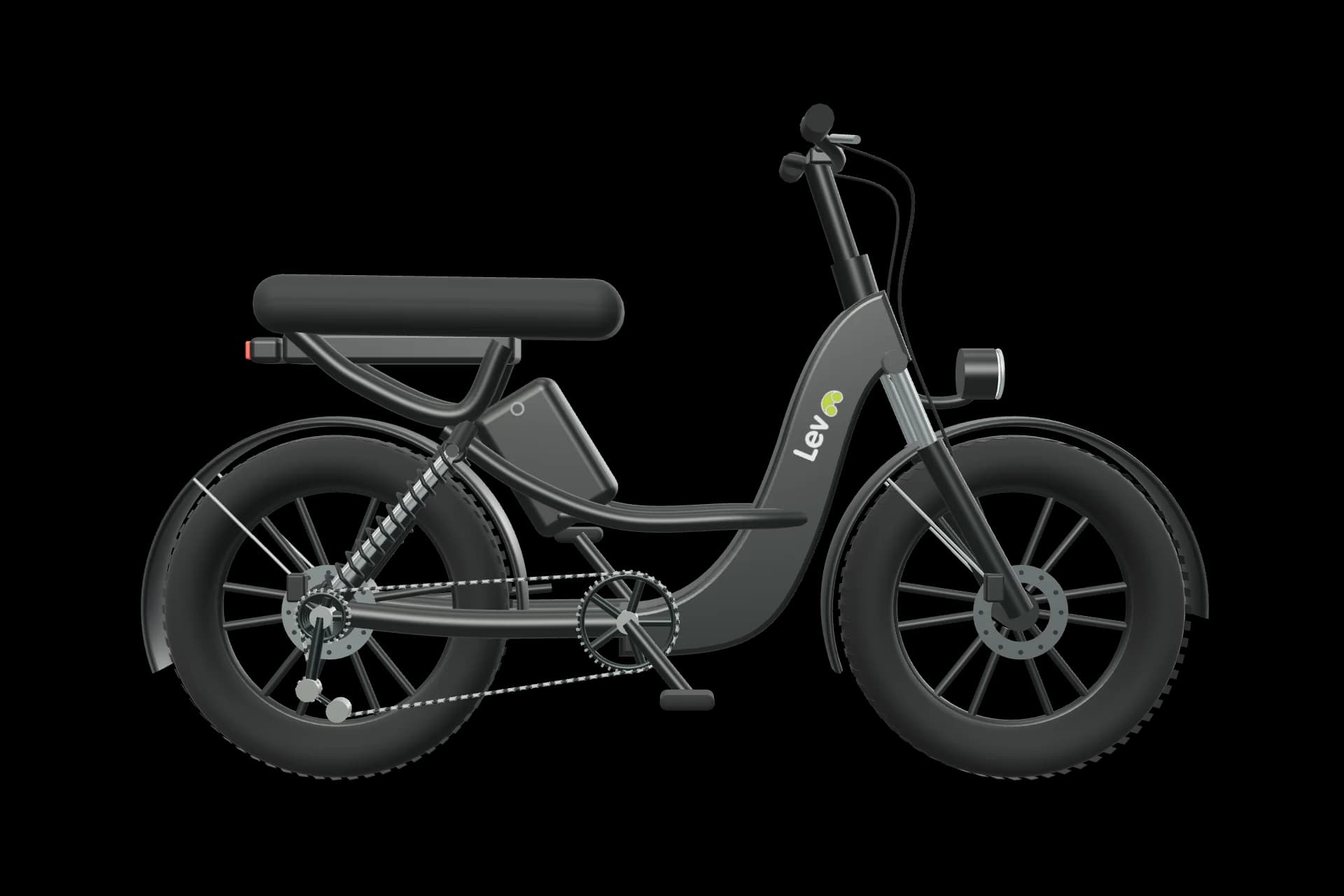
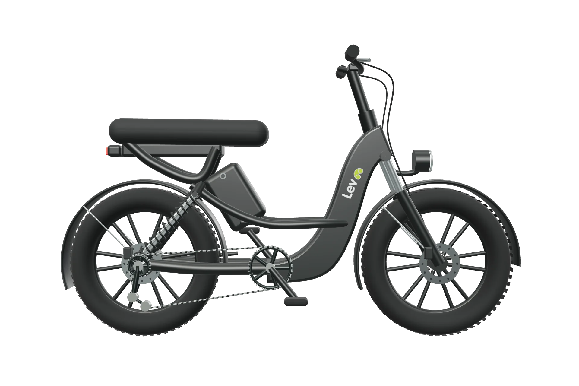
The latest Model C geometry from the Lev website makes the product inspectable. This is the same project model, presented directly in the portfolio. The website pairs that exploration with product comparisons and a practical model guide.

Lev Model C, rendered product view
Drag to explore · 360°
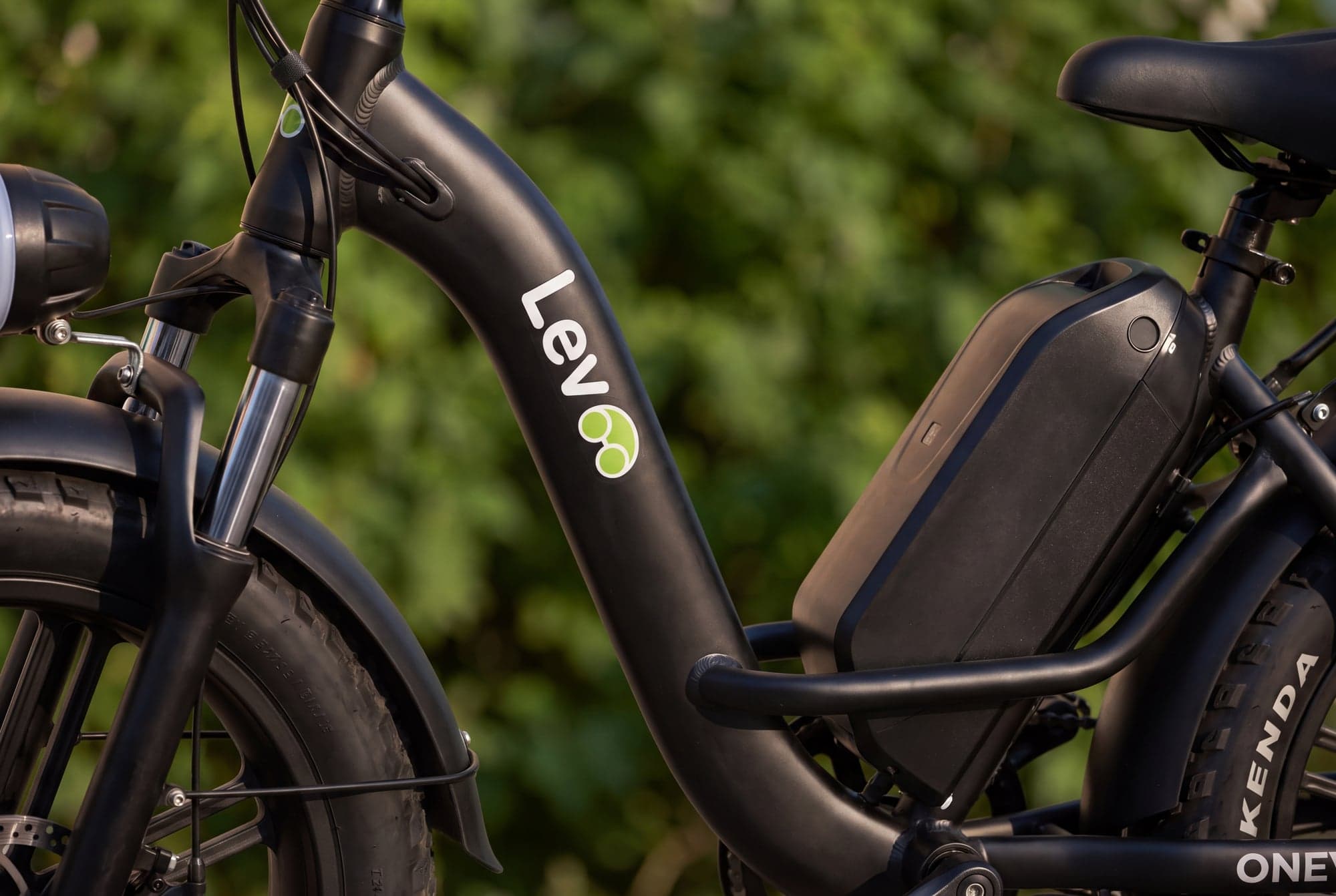
Lev concept close-up of frame and mechanical details
01 / Model C — each detail becomes part of the story.
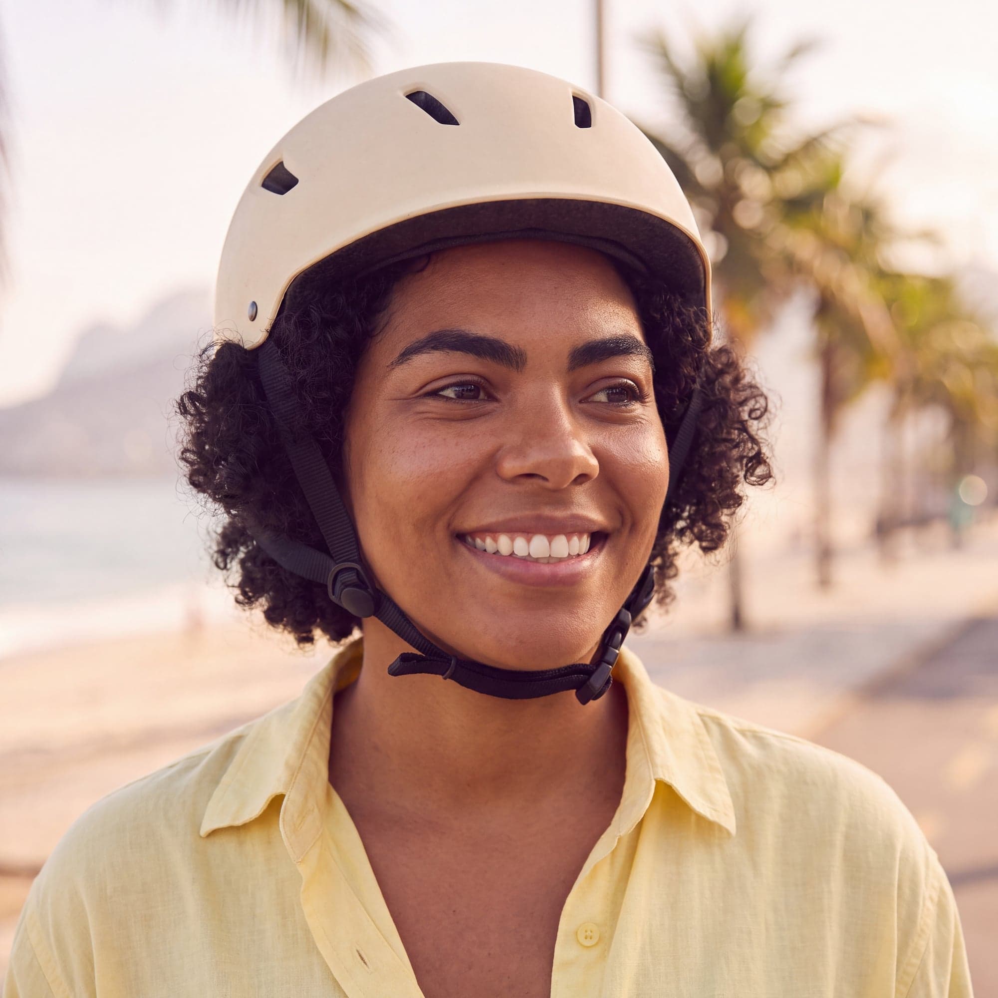
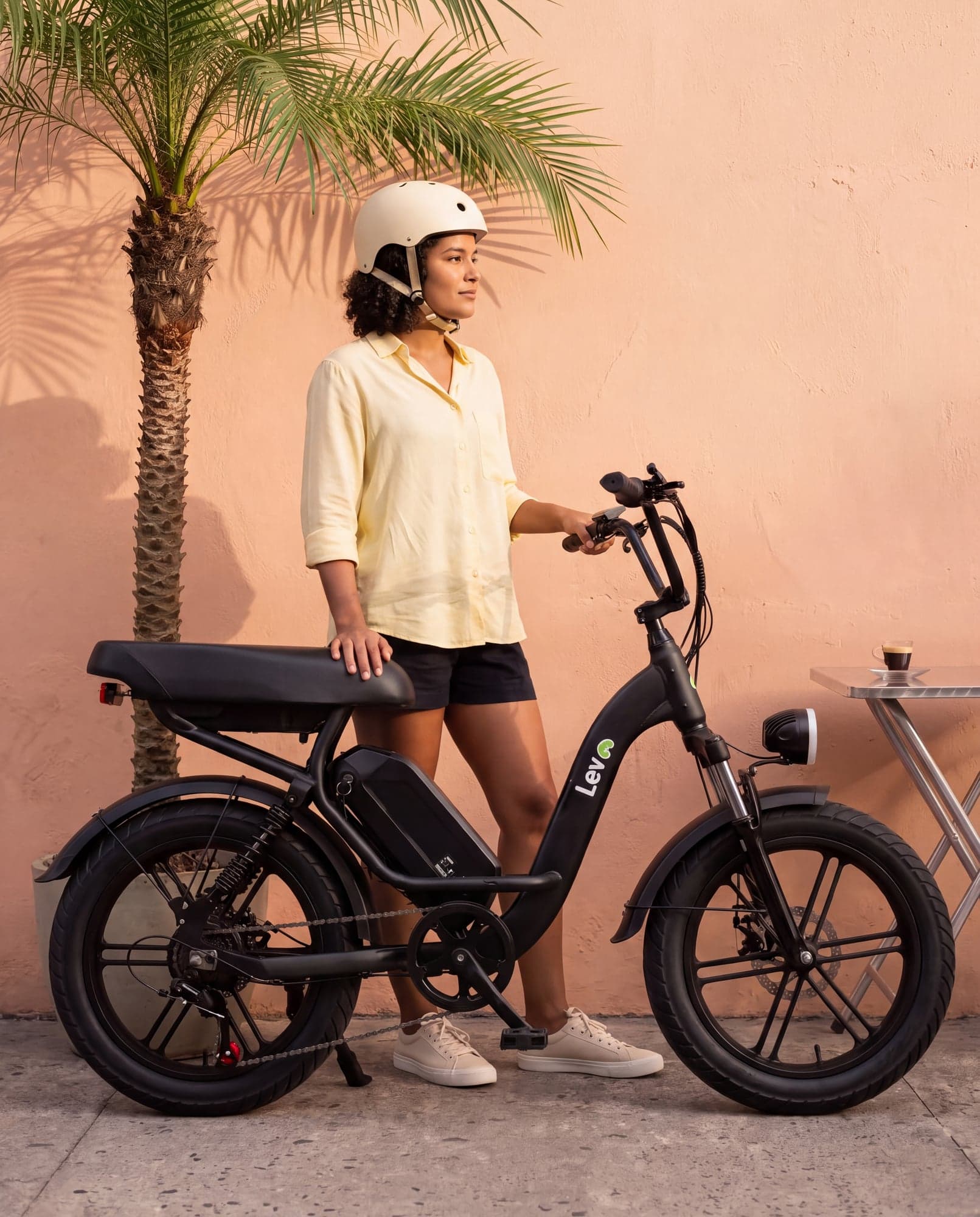
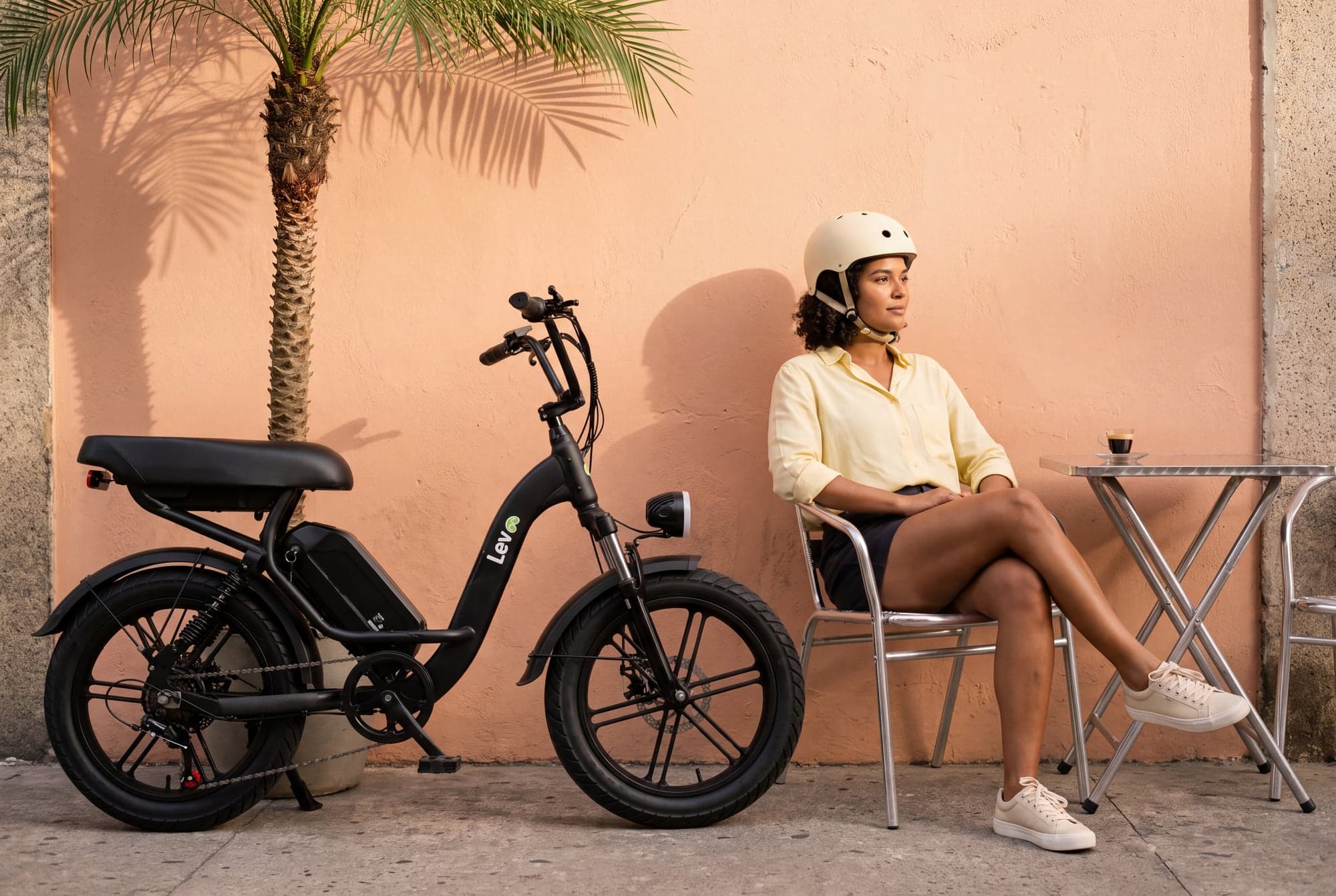
Lev campaign concept showing the bicycle in an everyday setting
02 / The product, in the life it is designed for.
06 / A living experience

Make room for the everyday.

The original website moves from its typographic hero into a close view of the bicycle. Scroll progression links the headline, product framing and mechanical details; the bicycle remains something the visitor can explore.

Lev campaign: bicycle and rider against sunlit peach architecture

A cidade
fica leve.

The result / Scope & credits

A complete point of view.

An independent website concept with original art direction, GSAP storytelling, pre-rendered interactive bicycle views, model discovery and a preference guide. It is not a commissioned Lev engagement, and no commercial results are claimed.

The logo follows the exact filled, single-color treatment used by the concept’s top navigation. Manrope, DM Sans, Portuguese copy and the Model C model come from the current golev concept. Campaign and detail imagery were generated for that concept.

View the moodboard & references ↗
Next perspectiveTrilo